
The Logo That Took a Polar Express Ticket to Get Right
Ethan McLaughlin, Creative Lead & Co-Founder of Pnchy

Hello everybody, my name is Ethan, and I’m the creative lead here at Pnchy. I grew up with a passion for the creative arts, and I’ve been working with color and design my whole life. I’ve made plenty of pieces of art, t-shirt designs for friends and businesses, created in any medium, any perspective, you name it, I’ve likely tried it at least once. Making our logo was an interesting challenge, particularly now that its success directly affects me and my closest friends and co-creators. I’d love to share some insight into my design process, and I hope you’ll take the time to read it!
When Aryan proposed the idea for Pnchy, he also ran a few other project ideas by my best friends from college and me. Pnchy stood out to me as the greatest opportunity to directly benefit the most people, and I was excited (though naturally cautious as per usual) from the get-go. For those of you who have just heard about this app and decided to give it a chance, thank you, and welcome to your first new community! To briefly introduce us, Pnchy is a community loyalty app built specifically for independent local businesses. Nowadays, too many small businesses full of brilliant ideas and passionate folks behind them get swept under the rug by chains and large corporations that tear away the human social element of commerce. We want to bring that small-town care back, bring people together again, and highlight your favorite local businesses that deserve the recognition they so desperately need. You may be thinking, how can you fit this into a logo? It’s impossible to portray that in such a small design. Yup, I thought the same thing, but I gave it a shot, and here is how it went!
Part 1: Swimmin' around in the good ol' Think Tank
I went through a good many different iterations to try and get this right. My original idea was to have our logo as a classic Times New Roman P, right next to a stylish hole puncher, with a punched-out hole in the middle of the P, see below:
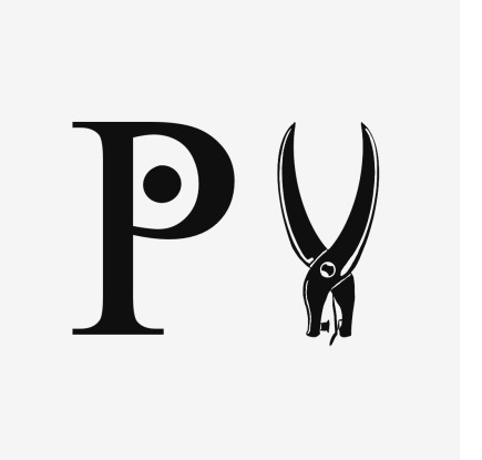
I felt the idea was simple but effective. Times is a classic newsprint font for printed media; we are a digital hole-punching app, the hole puncher is right there, and there’s a big ol’ punch right in the middle of it. I felt it could not be any clearer. There was quite a bit of mixed reception to it; the font was too sharp, the puncher was too aggressive (which hurt a little, I liked that puncher), so I ended up tweaking it a little bit. Rounding things off, I tried to make it friendlier, but I was starting to see a growing issue with the design:
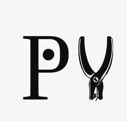
Details. Balls, there are too many details. From what I’ve been taught and read on logo design, you ride a very fine line between simplicity and chaos. Logos are meant to be elegant, sleek, and recognizable, and here my background in art and high-contrast inkwork was throwing highlights and reflections into the mix, leaving the P look too simple, and the puncher look too complex. I now understand what my peers meant. Even with the logo centered and the negative space on either half pretty proportional, the highlights make the logo feel lopsided and unbalanced, which is the opposite of what I want. I tried dumbing some things down, taking some shadows out…
Nope, that's a creepy eyeball. I don’t need Sauron’s eye glaring at our users. That got axed pretty quick:
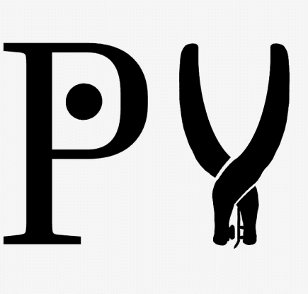
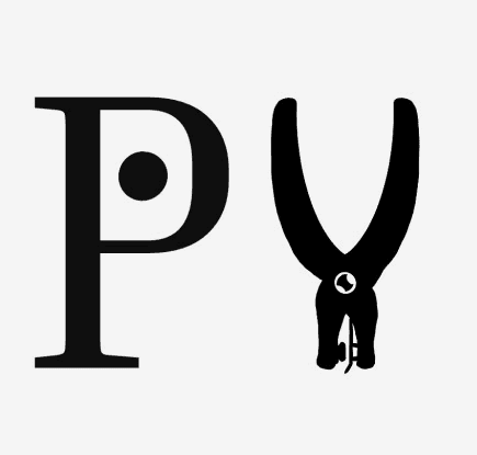
Hey, not too bad! I actually liked this one a lot. It finally felt more balanced; neither side of the logo felt overpowering. That being said, it started feeling like a barbershop logo for some reason, and while by all means support your local barbers, I know I do, we want to highlight every small business we can, not just our scissor wizards (which apparently is an actual business, fantastic choice by them). After calling my fellow Pnchies to council, we began a new era.
Part 2: The Good, the Bad, and the Gradient
During our conference call, one of our team members, Jevian, had the brilliant suggestion of calling back to one of the all-time favorite Christmas classics: The Polar Express! Everyone remembers the ticket-punching scene; that ticket is the driving force for nearly over half the movie! Seeing Believe punched out in that beautiful gold ticket resonated with me, and with that, so began a new era of this design…
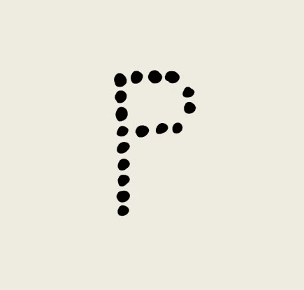
The Hole-Punched P! Tada!
Yeah, I know it’s a bit rough. That was a very quick, slanted, drawn-on-your-lap sideways P that felt as janky to make as it looks. But I did like the idea; it was goofy and fun, had some character, and had some really good potential. Naturally, the next step would be to clean that P up, right?

HA, wrong. We slapped a gradient on it.
Now remember how I mentioned earlier that details ride a fine line between pure logo ingenuity and just a straight horror show to look at? Gradients are typically in that same category. Public consensus is pretty evenly split on whether a gradient actually looks good in a logo. There are some companies that pull it off delightfully, like the Windows 7 logo or Instagram’s app icon. I do not believe ours was the case. And through a minor course of temporary delusion, I refined this bad boy, and we let it rip to the public:

I’ll admit I was very excited that we reached a final product (or so we thought), and as far as logos go, it’s not bad. The sunset gradient is very warm, inviting, and cozy. We put this one out to the public on LinkedIn, Instagram, etc., and we were ready to move on, until I hit the hardest roadblock of all: we still needed a full logo for the name.
Part 3: Burn it all down
Oh boy. I had a thousand thoughts with this. My team wanted to keep moving forward with the gradient; meanwhile, I was swimming with issues. How am I supposed to make the main logo cohesive with this? It’s just an orange gradient. Am I just going to make the rest of the text dots too? What do these colors even mean for us? I could make the main logo different from the icon, but then how the heck is anyone supposed to connect the two together?
I had to come up with a plan. A little design and developer insight for you: when you are making app logos, Apple requires three designs: one for light mode, one for dark mode, and a black-and-white version for “tinted mode,” which can be tinted with any color. Having a gradient immediately posed an enormous problem for that, especially since all the color is in the background; if we go to dark mode, it’ll just look the same as the black-and-white tinted mode. Sure, we could put the gradient in the punches, and that actually looked pretty cool, but that brought me back to the same question: why just two arbitrary oranges? Everything in a logo should be important, from the color choices to the font spacing to the design's flow that guides your eyes on a natural path across it. With that in mind, I finally came up with our design, a mixture of all the best ideas with all my best intentions.
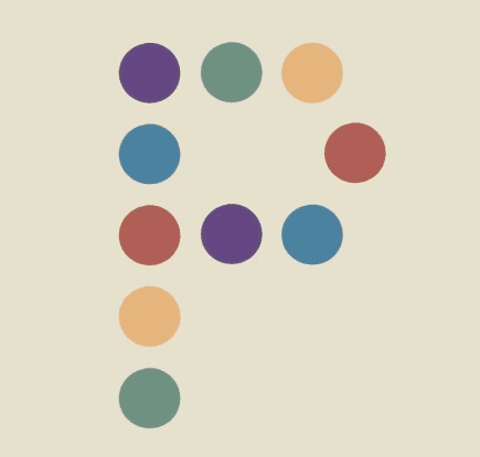
Ahhh, there we go. Looking at this feels like reading a good book to me. Believe it or not, I thought a lot about this one. I wanted to keep the hole-punched P, since it could work great as a solo icon and as part of a larger logo, so I stuck with it. I ditched the gradient and went with a rainbow of colors instead. Our company is for all businesses, for all audiences in our communities, and what better represents that than the full spectrum of the rainbow? I shifted the color palette to a more muted shade to be softer on the eyes. We want Pnchy to be recognizable, not flashy, since the real stars are our hard-working partners and the folks who support them. With 5 colors in our palette, I changed the P to be just 10 dots for a nice, simple pattern. Finally, I found something I was happy with, that our team all liked too, and now here we are! And I couldn’t be prouder of it.
If you actually read through all of this, kudos. I hope you at least smiled as you worked through my thought process. I know I can be all over the place sometimes. I’m really happy with our logo decision. Pnchy aims to positively impact as many small business owners and their customers as we can, so we can grow our community and help others shine. We want to be your new home away from home, the foundation from which you succeed. Whether that’s connecting you with new people, trying new things, or helping your brilliant ideas get recognized in a big way, we want to be there supporting you with the help you deserve. After that long design debacle, I think our logo does bring that feeling of home, of comfort, simplicity, and security. That homemade chicken noodle soup from a loved one on a cold winter day type of feeling. A place to love, be loved, grow, and thrive. I hope you think so too.
I really am terrible at endings. I can’t seem to wrap this up. Thank you again for listening (well, I guess reading technically?) to my thought process and all the hiccups I had along the way. I hope you had as much fun reading it as I had writing it and designing our logo! From everyone here at Pnchy, thank you for giving us a chance, and we hope you’ll stick with us as we grow, too. More from us soon ;)